Changing the URL experience with typography
I started using the Locationbar² Firefox add-on a few weeks ago, and I've been amazed at how significantly it changes the experience with URLs. The interesting thing is that I already think about URLs as RESTful commands... but when you see URLs broken apart visually into distinct domain, path, and argument sections, the visual interpretation quickly change from "a bunch of random text that the browser understands", into "a domain-name/brand, and specific service".
It's difficult to explain without visuals, so let's start with a traditional looking URL:
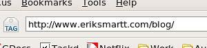
The traditional-looking URL is a bunch of text. We recognize it as a URL, and typically market it as a full-text string. However, many sites use non-friendly URLs (think Vignette CURLs, for those who know what I'm talking about) in which case URLs are often massive strings full of seemingly random characters. When surfing sites with such URLs, the browser's location bar becomes something you ignore until you're ready to type in a new address.
Now let's look at a Location'ized version of the same URL:
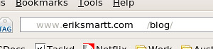
Quite different! The Location'ized URL is a distinct representation of a domain name ("eriksmartt.com") and a service ("blog"). Information we don't need, which normally just causes visual clutter (like the '/' characters) has been greyed-out, and brand-recognition remains strong.
Here's another example:
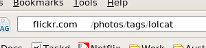
Just looking at that URL, it's pretty clear what site I was on, and what I was asking for -- which is exactly what a URL is. Writing out http://flickr.com/photos/tags/lolcat loses some of this meaning. It becomes a single address, rather then a service and a request.
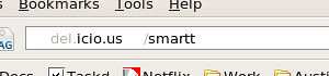
Of course, clever domain-names can lose some of their brand recognition using this approach:
Still, I've already grown so accustom to seeing URLs as Locationbar² displays them, that it feels disappointing to use browsers lacking this capability. I've also found the tool to be extremely handy while developing websites, making it very clear which server I'm accessing, and what request I made.
YMMV but I definitely recommend trying it out -- and I'd love to hear about your experience using the add-on!