View your site with Nokia Open Source web browser today
You've heard about Nokia's open source web browser for S60 based on Apple's WebCore/JavaScriptCore right? I'm sure you have. But did you know that you can try it out right now? I didn't either.
The odds are pretty good that you (like me) don't have an S60 3rd Edition phone that can run the new browser. Fortunately, there's a build included in the new S60 3rd Edition SDK. What you need is the final build of the SDK, which can be found here: http://www.forum.nokia.com/main/0,6566,034-4,00.html. (If you get totally lost on Forum Nokia, don't forget about the Google Mini powered search: http://search.forum.nokia.com/!)
The download page defaults to the Japanese version, so make sure you change the drop-down menu to "SDK for 3rd Edition" if you want English. (Note: the "beta" version doesn't seem to have the new browser.)
Once you install the SDK (and sadly, you'll need a Windows machine for this) launch the SDK, wait awhile, and once the phone menu screen comes up, navigate to the "Installed" folder. In there you will find an application called "Web". That's the new browser!
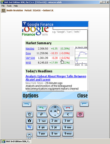
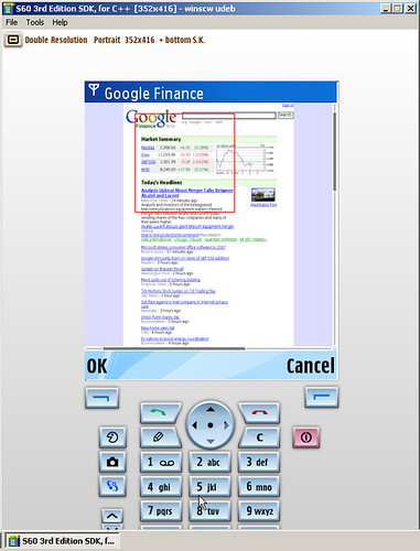
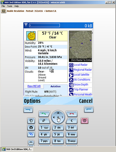
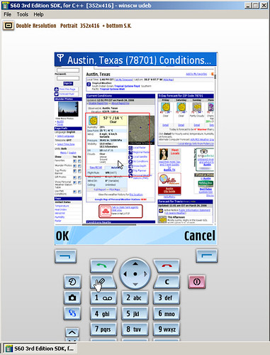
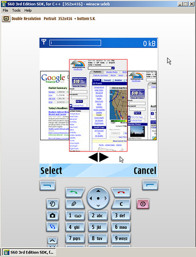
I did some quick browsing from the emulator and took screen shots to give an idea what this new software is capable of:
-- [Update: 2006-05-24]
The OpenDarwin Wiki now contains a page with instructions on running the new S60 browsing within the emulator. Thanks for the tip Franklin!